For Mother's Day this year, my dear husband bought me my first DSLR camera. It was an amazing craigslist find and I'm still in awe that I got such a great deal on it. Anyway, I've been snapping pictures like a crazy woman for the past month and I still can't get enough!
Yesterday was my first time using Photoshop to edit my pictures. Oh.My.Word. Can anyone say - new addiction? As if I needed one more thing to distract me from the mountain of laundry that's threatening to take over the house. Anyway.
We Picture This is a cool site that has lots of photo related goodies and loads of inspirational pictures. I'm joining in the fun and posting a before and after picture.
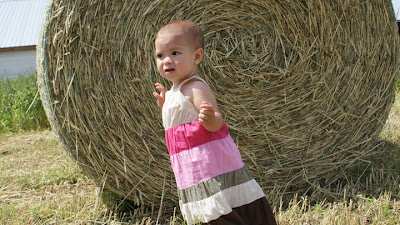
I shot this picture a couple weeks ago with my Sony A300 on the auto setting. (I literally just figured out how to use the manual setting like two days ago, so all you photo junkies, don't judge me.)
Before:

I cropped it slightly, added an yellow overlay by adding a new layer and then set the opacity to about 35%. I added a lighting effect filter that I think makes that round bale of hay look super interesting and viola! I think it looks kind of cool. In a very this is my first time editing, you can tell I didn't know what I was doing kind of way.
After:

More of this before and after stuff to come, I assure you...or I warn you, I'm not sure which.


I'd be dangerous if I had a DSLR and Photoshop! Looks like such fun! Love the pic. Peanut looks like she plans to take flight. :)
ReplyDeleteI really like the yellow tone in the bale of hay. If you are in PS, you will have a way to remove your yellow layer from your daughter to make her stand out against the hay bale (and look less yellow).
ReplyDeleteEditing in PS is a steep learning curve and this is a great first attempt. And you're right it is an addiction! :)
This is great first attempt - I am impressed that you figured out how to do an overlay right off the bat! The hay looks great - as the previous commenter mentioned, you can erase the overlay from off your subject so they stand out a bit more, that opens up a whole new world of possibilities!
ReplyDeleteI do like how the coloring in this feels almost like an old photograph, just as it is... like a faded Polaroid or something. Fun!
You have an award at my blog!
ReplyDeletehttp://kaycesdoulajourney.blogspot.com/2009/06/my-first-award-show.html
If you want some more inspiration for editing, check this out. Some of her stuff is kind of obvious (hello, "the tree trunk method" is called "diffused light") but she has some awesome filters, etc. Enjoy!
ReplyDeletethis looks so interesting, I need to look into this camera, is it expensive??
ReplyDelete